
Sales Calendar
Powered by TodayTix provides automated sales reporting for every event on the platform. Reports are delivered by email and updated in the partner portal, so you always have a reliable picture of how your event is performing — without manual data pulls or spreadsheets.
The sales calendar is an interactive dashboard in the partner portal that presents the same data as the email reports in a visual calendar layout, powered by the same source. Where the emails deliver a daily snapshot, the sales calendar lets you explore the data yourself: zoom into a single day, compare across weeks, follow the advance position, and drill down into the dimensions that matter most.
Use the sales calendar to:
- Run marketing meetings — the visual layout looks impressive on screen and makes trends immediately obvious
- Investigate individual performances — drill into any day to see exactly what happened, broken down by channel, retailer, section, ticket type, performance or hour
- Track the advance — see where the event stood on any date, not just what sold on it
- Compare against benchmarks — every figure carries automatic comparisons: last week, last year and a 90-day average on the day grids, last month, last year and a 12-month average on the year grid
- Present to stakeholders — the calendar is a strong visual format for board meetings, investor updates, and producer briefings
Prerequisites
- A partner portal account at portal.poweredbytodaytix.com
- At least one event on sale
Accessing the sales calendar
- Log in to the partner portal.
- Navigate to Insights > Sales calendar in the sidebar.
- Choose an event. The calendar reads one event at a time.
Choosing what the calendar shows
Four controls sit above the calendar. Together they decide what each date reads, which figure it shows, how wide a window you see, and — in Transactions — which dates are covered.
Report types
Metrics
Gross and net are separate metrics rather than a toggle — switch between them in the same dropdown. All packs gross revenue, net revenue, tickets and ATP into every cell at once, for when you want the whole picture per day rather than one line of it. Switching report type keeps your metric where it still applies and falls back to gross revenue where it doesn’t.
Figures render in the event’s own market — its currency, number format and timezone — not the viewer’s.
Granularity
Month shows a single month as a day grid. Year shows all twelve months of the year with quarter subtotals; click any month to drop into its grid.
Date range
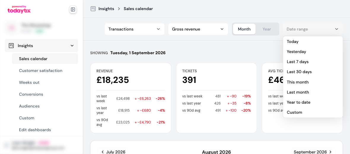
In Transactions, the date-range control sets the window. Pick a preset or choose Custom to open the calendar picker:
Every preset resolves against today in the event’s market timezone, so a late-night reading doesn’t roll over early.
Performances and Advance have no date-range control: one groups by performance rather than by transaction date, and the other reads a position rather than a span.
Transactions view
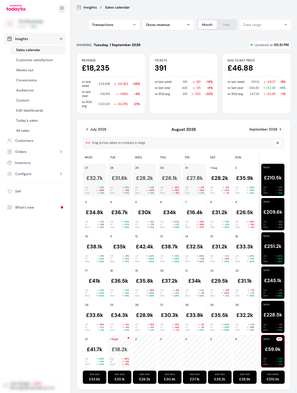
The default view shows the selected metric by day across a calendar month.
What you see
- Monthly calendar — the selected metric for each day, with arrows to move month by month
- Week column — a subtotal for each week down the right-hand side. On the Tickets metric a toggle appears above it, switching between Total (the week summed) and Avg (divided by the days with data), so a part-finished week still compares fairly
- Today — drawn with a striped background, because the day is only part-way through
- Comparison indicators — every day shows the delta versus three benchmarks
KPI cards
Three summary cards sit above the calendar — Revenue, Tickets sold and ATP — covering whatever range is selected. A line above them names the dates they cover, so the figures are never read as all-time totals.
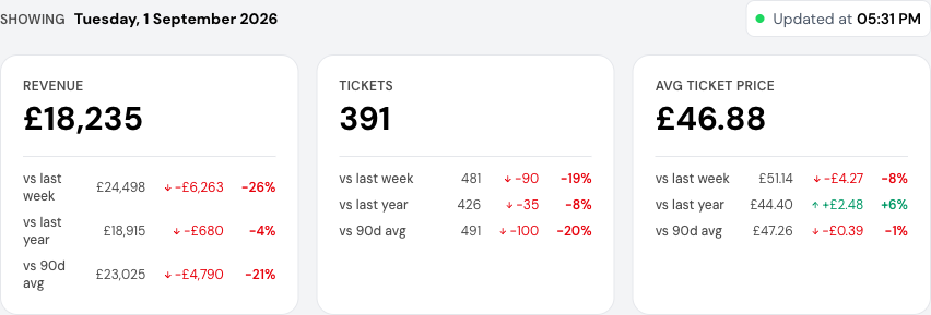
Each card shows the absolute and percentage change against the same three benchmarks as the grid.
Comparisons and benchmarks
Movements smaller than 0.5% read as flat rather than up or down, so day-to-day noise doesn’t flicker the arrows.
Over a range longer than 31 days, week-over-week and 90-day comparisons stop meaning much for an aggregated total, so the cards keep only the year-on-year row.
The year grid compares on its own scale: each month reads against last month (LM), last year (LY) and a rolling twelve-month average.
Data freshness
An Updated tag sits beside the headline cards, showing the event’s latest ticket sale — as “2 min ago” while it’s recent, and as a clock time in the event’s market timezone once it isn’t. It reads the data, not your clock.
The figures come from a warehouse table that rebuilds every 15 minutes, and the calendar re-reads the trailing week every 10 minutes while the page is open. Worst case, a number is around 25 minutes behind the box office.
Today’s figures are marked incomplete, and refunds or late settlement can still move a day for a while after midnight — which is why the recent window is re-read rather than frozen at page load. In Advance, the tag reads As at instead: a position at the start of a date is already settled and doesn’t move.
Selecting a range of dates
Drag across the grid to select a span of days. A bar appears along the bottom of the window naming the range and the number of days, with View breakdown and Clear selection. The headline cards re-read the selection while it’s active; Esc clears it.
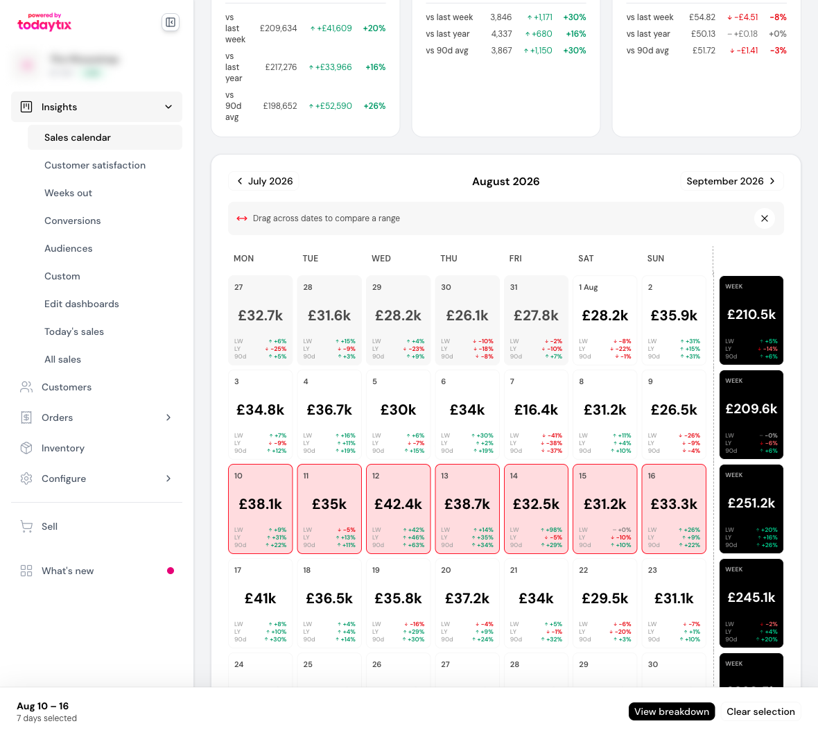
View breakdown opens the same drill-down a single day gets, over the whole range. Ranges longer than 92 days can’t be broken down — the query returns a row per date and dimension value, and beyond that it would be silently cut short.
Drilling into a day
Click any day on the calendar to open the daily breakdown — a detailed view of everything that happened on that date.
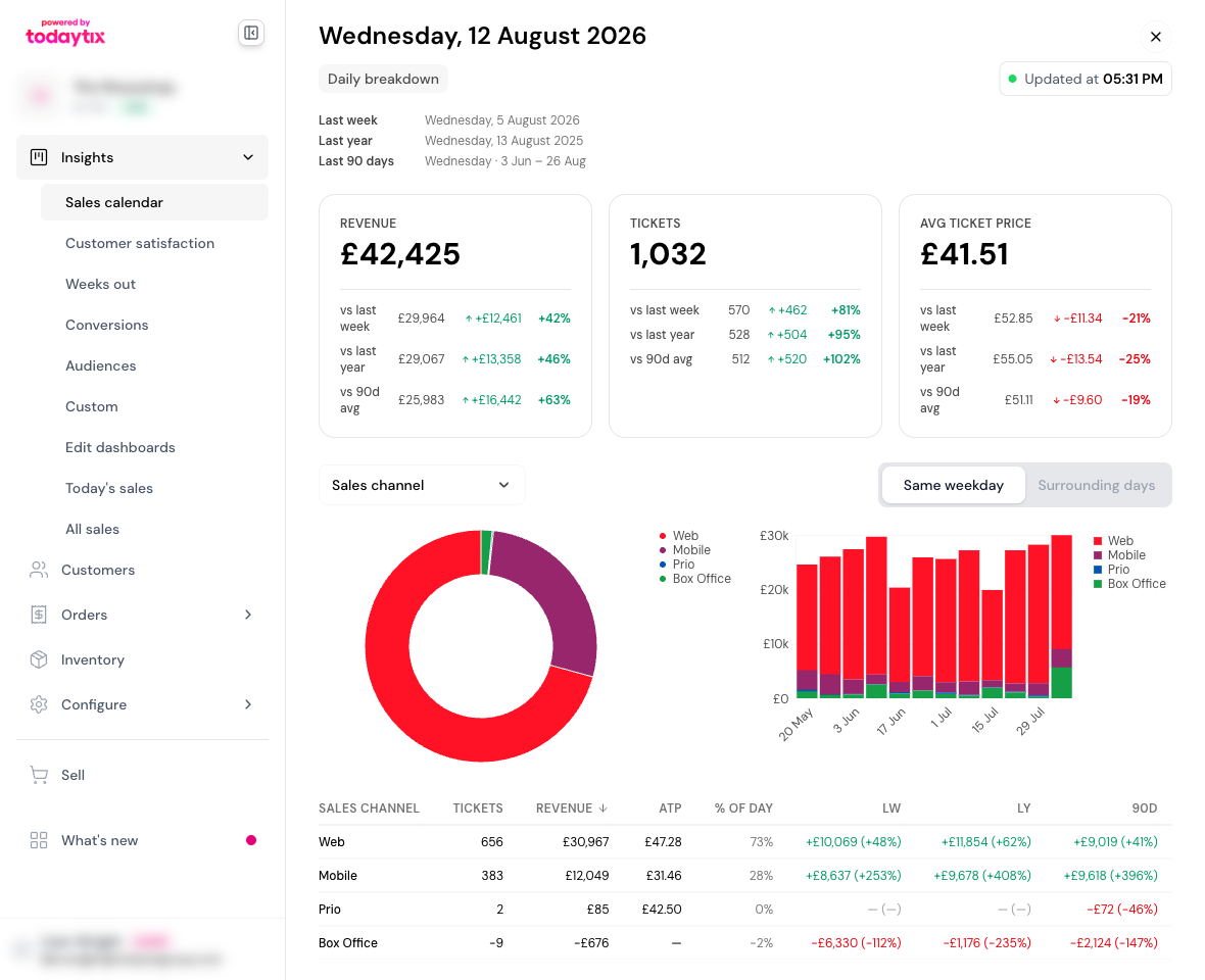
The drill-down includes:
- Comparison context — the exact dates being used for last week, last year, and 90-day average comparisons
- KPI cards — revenue, tickets, and ATP for this day with all three comparisons
- Donut chart — sales distribution by the selected dimension (e.g. sales channel)
- Comparison chart — the same dimension plotted over time, with two viewing modes
- Data table — tickets sold, revenue and ATP per value, with its share of the day and the same comparison deltas
Charts and legends show the ten largest values and fold the rest into a single Other band, so a day scattered across dozens of performances still reads.
Drill-down dimensions
Use the dropdown above the charts to slice the data:
Event time is only offered for a single day; Hourly sales describes one day, so neither appears on a multi-day range.
Hourly sales
An hour is a position in the day rather than a category, so this option swaps the donut and comparison chart for two readings of the same rows:
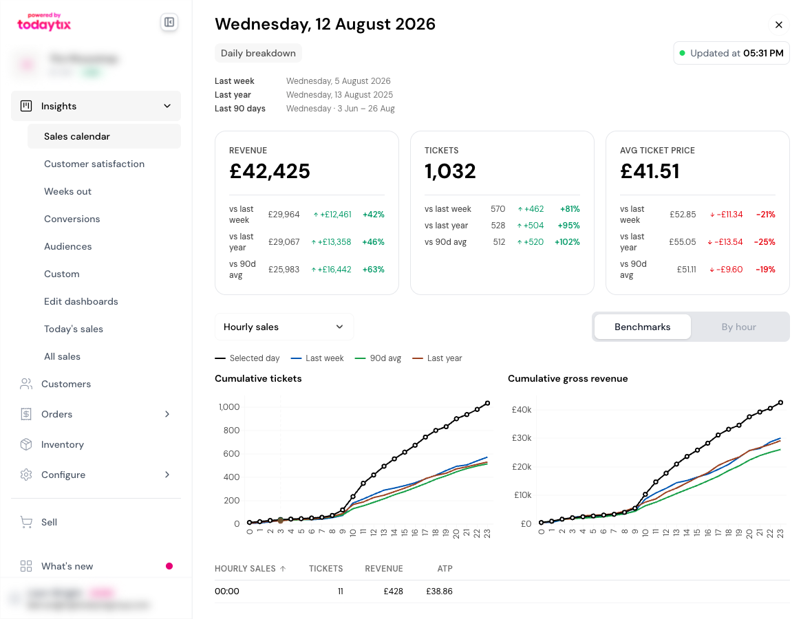
The hour still filling is marked incomplete.
Performances view
Switch the report type to Performances to see the same data organized by performance instead of by transaction date.
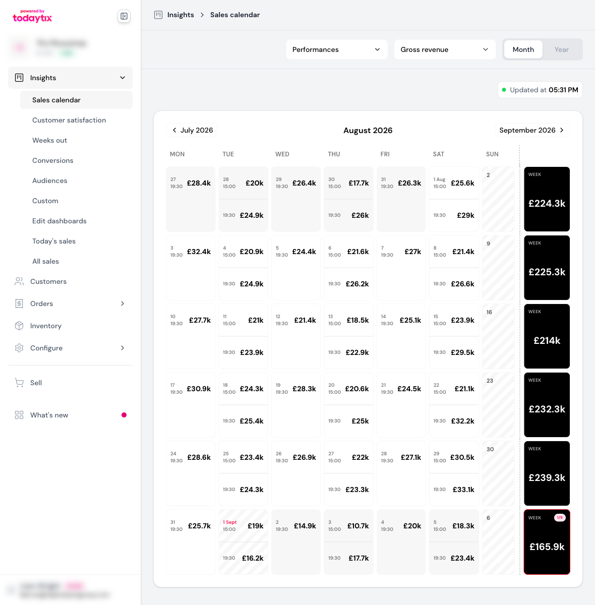
Each day displays its performances as blocks, each with its start time and the selected metric. Days with more than three performances show the first three with a “+N more” indicator, and the week column still totals the week.
There is no date-range control and no headline cards here — the view groups by performance rather than by a window of transaction dates.
The performances view adds a Capacity metric — the percentage of seats sold, shown as a coloured pill — alongside tickets, revenue and ATP.
Performance drill-down
Click a performance to open its breakdown. It carries:
- A performance picker beside the date — read one showtime, several, or all of the day’s
- An occurrence summary — the performance’s headline figures, with tickets split into sold and comps, and day-of sales called out separately
- The same headline cards and breakdowns as a day, minus event time and hourly sales — both of those describe a day, and this is already one performance
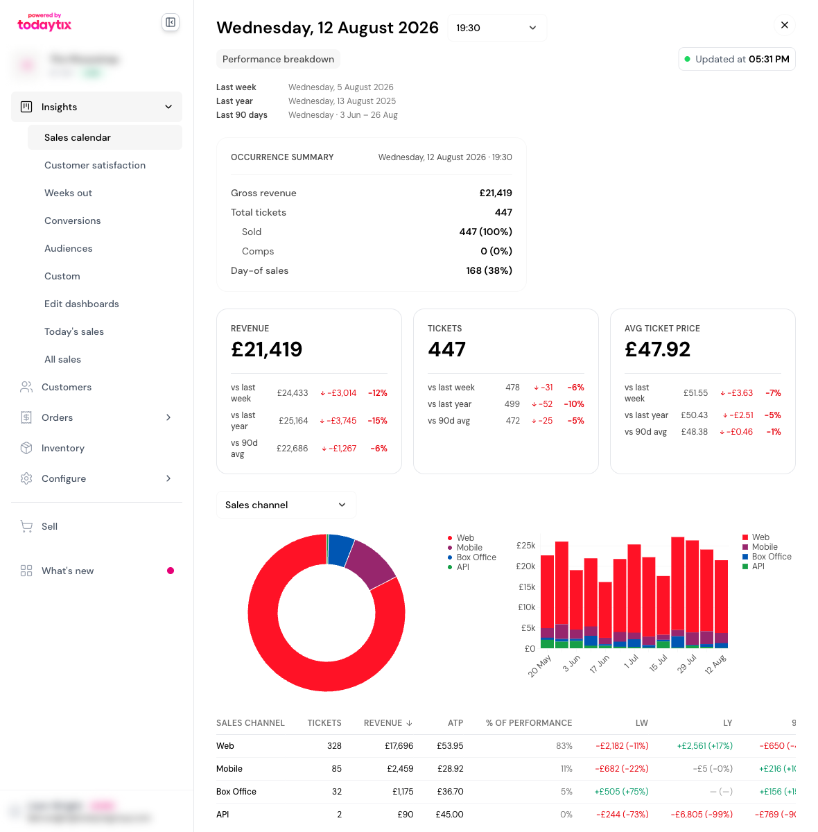
The occurrence summary mirrors the content of the after-showtime email, so you can refer back to any previous performance’s summary directly in the portal.
Advance view
Switch the report type to Advance to read the running position instead of daily takings. Each date shows where the event stood at the start of that date, so a date’s figures reconcile with that morning’s daily sales email.
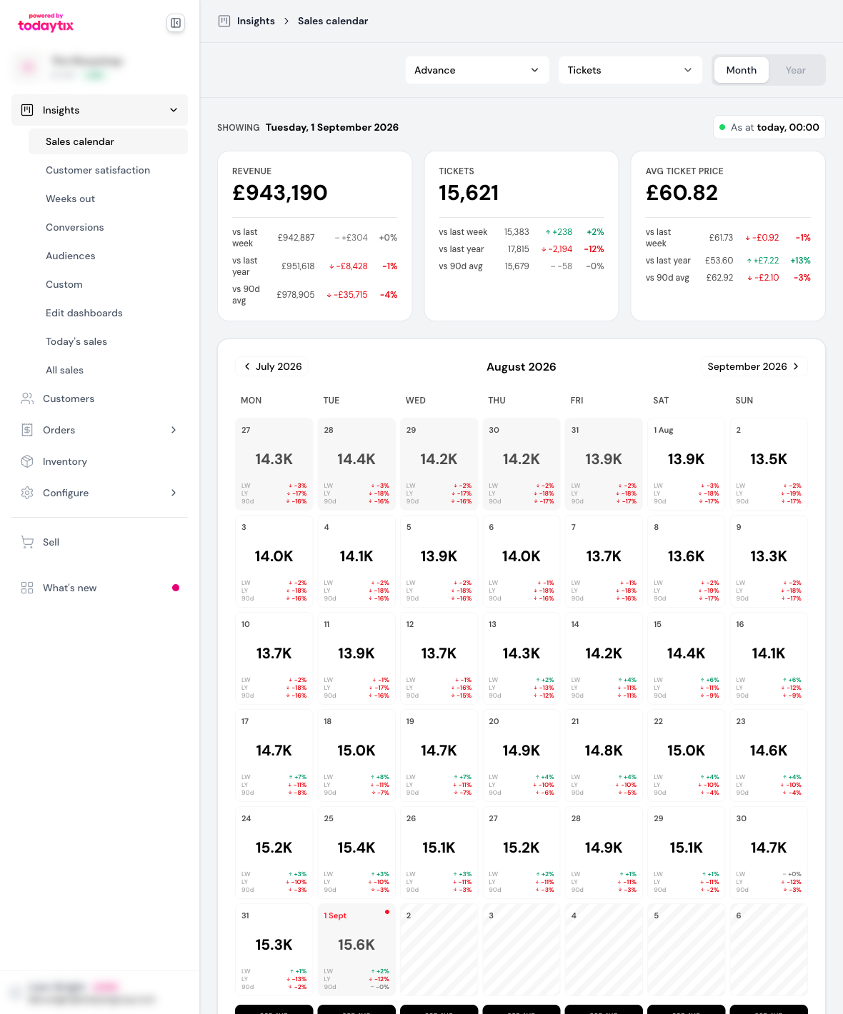
Because every cell is a position rather than a day’s trade, the advance grid has no week column, no range selection and no drill-down: a span of positions has nothing to add up, and a position as at a date can’t be split by channel or retailer. Comparisons still apply — a position against last week’s, last year’s and the 90-day average.
Year view
Switch the granularity to Year to see all twelve months at once, with quarter subtotals.
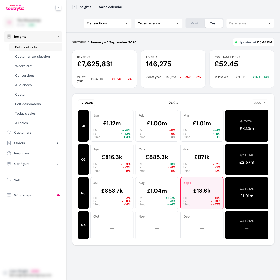
In Transactions and Performances a month is its dates summed; in Advance a month reads its closing position, and a quarter its closing month. Click any month to drop into that month’s grid.
Sharing a view
The calendar keeps its full state in the page URL — report type, metric, granularity, month, date range, and the day or range you have open. Copy the address bar and whoever opens it lands on exactly what you were looking at, provided they have access to the event.
Next steps
- After-Showtime Email — the per-performance email sent 30 minutes after curtain
- Morning Email — the daily digest delivered to your inbox automatically
- Email Attachments — detailed PDF and CSV breakdowns per performance
- Bring Your Own Dashboard — build custom charts and visualizations with AI