
Bring Your Own Dashboard
Powered by TodayTix provides automated sales reporting for every event on the platform. Reports are delivered by email and updated in the partner portal, so you always have a reliable picture of how your event is performing — without manual data pulls or spreadsheets.
Bring Your Own Dashboard gives you a personal whiteboard where you can create custom charts and visualizations using AI. Instead of requesting a bespoke report and waiting for it to be built, you type a request in plain language — “show me weekly revenue by section” — and the dashboard builds it in real time from live data.
Use the dashboard to:
- Answer ad-hoc questions — instead of waiting for a bespoke report, create exactly the chart you need in seconds
- Build views for stakeholders — create investor-ready or executive-facing dashboards that you can export as PNG or CSV
- Explore data your way — the system doesn’t prescribe a fixed layout; you decide what matters and how to visualize it
Prerequisites
- A partner portal account at portal.poweredbytodaytix.com
- At least one event on sale
Getting started
- Log in to the partner portal.
- Navigate to Insights > Custom in the sidebar.
- Open your whiteboard tab.
Your whiteboard is personal to you, not to a specific event — the same layout appears regardless of which product you are viewing, so you only need to set it up once.
Creating charts
The whiteboard includes an AI assistant that accepts plain-language prompts. You can use the preset suggestions or type your own request.
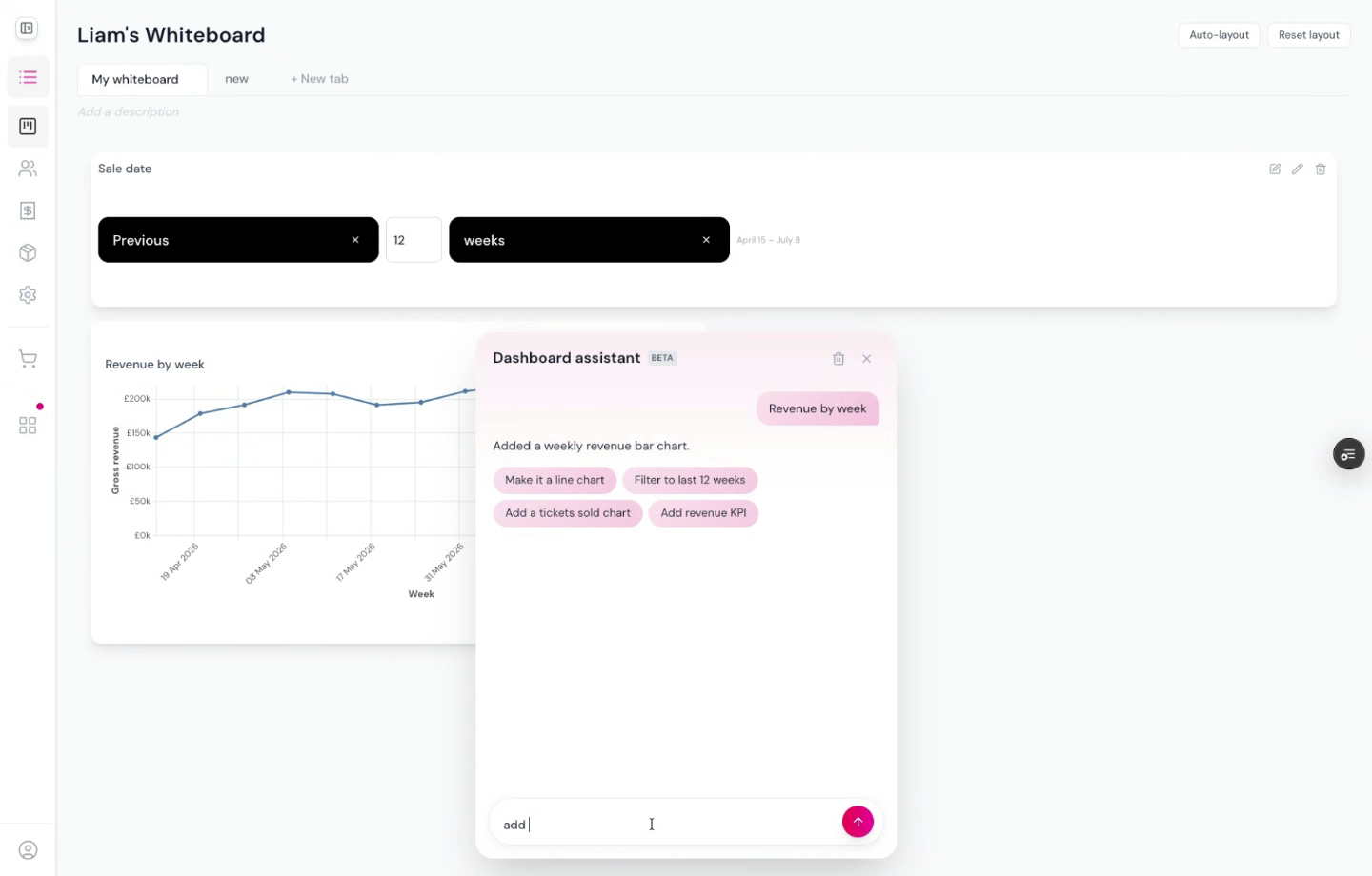
Examples of prompts:
- “Show me gross revenue by week for the last 12 weeks”
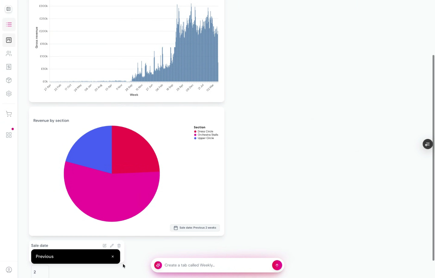
- “Create a pie chart of sales by section”
- “Add a trend line to revenue by week”
The AI creates the chart using real, live data. You can then:
- Move and resize charts by dragging them on the canvas
- Add date filters — request a filter and the AI adds a date control that connects to your charts automatically
- Create multiple tabs to organize different views (e.g. one tab for revenue, another for occupancy)
Exporting
Each chart can be exported individually:
The CSV export shows the exact data powering the chart, so you can verify what values are being used and how they are calculated.
Next steps
- Sales Calendar — pre-built interactive dashboard with comparisons and drill-downs
- After-Showtime Email — per-performance email sent 30 minutes after curtain
- Morning Email — daily digest delivered to your inbox automatically
- Creating Custom Reports — scheduled reports with granular transaction-level data